Welcome to our comprehensive guide on CSS positioning with examples. Mastering CSS positioning is essential for creating precise and visually appealing web layouts.
In this article, we will explore the various CSS positioning techniques, such as static, relative, absolute, and fixed positioning, with practical examples to help you understand and implement them effectively in your projects.
Table of Contents
Introduction
Overview of CSS Positioning
CSS positioning is a fundamental concept in web development that allows designers to control the layout and arrangement of elements on a webpage.
By understanding and utilizing various CSS positioning techniques such as static, relative, absolute, fixed, and sticky positioning, developers can create precise and dynamic layouts that enhance the user experience.
In this article, we will delve into the intricacies of CSS positioning with examples, providing practical insights and code snippets to help you master this essential skill.
Importance of CSS Positioning in Web Design
The importance of CSS positioning in web design cannot be overstated.
Proper use of positioning techniques enables developers to create visually appealing and well-structured web pages, ensuring that elements are displayed exactly where they are intended.
This is crucial for responsive design, as it allows webpages to adapt seamlessly to different screen sizes and devices.
By exploring CSS positioning with examples, you will gain a deeper understanding of how to create layouts that not only look great but also function efficiently across various platforms, ultimately leading to a better user experience.
Understanding the Basics of CSS Positioning
What is CSS Positioning?
CSS positioning is a technique used to control the placement of HTML elements on a webpage. It allows developers to define how elements should be displayed in relation to one another and the overall page structure.
By using CSS positioning, you can move elements to specific locations, layer them on top of each other, and control their behavior as the user interacts with the page.
This article will provide a comprehensive understanding of CSS positioning with examples, making it easier to grasp these concepts and apply them effectively in your web design projects.
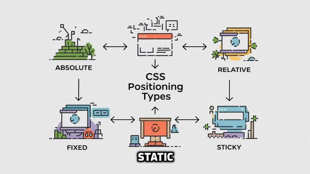
Types of CSS Positioning
There are several types of CSS positioning, each serving a unique purpose and offering different levels of control over element placement.
The main types include static, relative, absolute, fixed, and sticky positioning.
Static positioning is the default method where elements are positioned according to the normal flow of the document.
Relative positioning allows elements to be positioned relative to their normal position.
Absolute positioning places elements relative to their nearest positioned ancestor, while fixed positioning attaches elements to the viewport, making them stay in place even when scrolling.
Lastly, sticky positioning is a hybrid that toggles between relative and fixed positioning based on the user’s scroll position.
Understanding these different types of CSS positioning with examples will enable you to choose the appropriate method for your design needs.
Static Positioning
Definition and Usage
Static positioning is the default positioning method for HTML elements in CSS. When an element is positioned statically, it follows the natural flow of the document, meaning it appears in the order it is written in the HTML code.
Static positioning does not allow for any custom placement adjustments; the elements are placed as they would normally appear on the page.
This type of positioning is often used for elements that do not require special layout considerations and should remain in their default positions. In our exploration of CSS positioning with examples, we’ll see how static positioning forms the foundation upon which other positioning methods build.
Example of Static Positioning
To illustrate static positioning, consider the following example
<!DOCTYPE html>
<html lang="en">
<head>
    <meta charset="UTF-8">
    <meta name="viewport" content="width=device-width, initial-scale=1.0">
    <title>Static Positioning Example</title>
    <style>
        .static-element {
            background-color: lightblue;
            padding: 20px;
            margin: 10px;
        }
    </style>
</head>
<body>
    <div class="static-element">This is a statically positioned element.</div>
    <div class="static-element">This is another statically positioned element.</div>
</body>
</html>In this example, the two <div> elements with the class static-element are positioned statically by default.
They appear one after the other in the order they are written in the HTML, following the natural flow of the document.
This simple example demonstrates how static positioning works as part of our broader discussion on CSS positioning with examples.
Relative Positioning
Definition and Usage
Relative positioning allows you to position an element relative to its normal position within the document flow.
When an element is positioned relatively, it remains in the document flow, but you can adjust its position using the top, right, bottom, and left properties. These adjustments are made relative to where the element would have been placed if it were positioned statically.
Relative positioning is useful when you need to make slight adjustments to an element’s position without removing it from the normal document flow.
In this article on CSS positioning with examples, we will explore how relative positioning can be used to fine-tune element placement while maintaining the layout structure.
Example of Relative Positioning
To understand relative positioning, consider the following example:
<!DOCTYPE html>
<html lang="en">
<head>
    <meta charset="UTF-8">
    <meta name="viewport" content="width=device-width, initial-scale=1.0">
    <title>Relative Positioning Example</title>
    <style>
        .relative-element {
            position: relative;
            top: 20px;
            left: 30px;
            background-color: lightgreen;
            padding: 20px;
            margin: 10px;
        }
    </style>
</head>
<body>
    <div class="relative-element">This element is relatively positioned.</div>
    <div class="relative-element">This is another relatively positioned element.</div>
</body>
</html>Absolute Positioning
Definition and Usage
Absolute positioning allows you to place an element precisely where you want it on the page, removing it from the normal document flow.
When an element is positioned absolutely, it is positioned relative to its nearest positioned ancestor (an ancestor with a position other than static).
If there is no such ancestor, it will be positioned relative to the initial containing block, typically the <html> element.
This method is ideal for elements that need to be placed in specific locations on the page, independent of other elements.
In our discussion on CSS positioning with examples, we’ll see how absolute positioning provides precise control over element placement.
Example of Absolute Positioning
To illustrate absolute positioning, consider the following example:
<!DOCTYPE html>
<html lang="en">
<head>
    <meta charset="UTF-8">
    <meta name="viewport" content="width=device-width, initial-scale=1.0">
    <title>Absolute Positioning Example</title>
    <style>
        .container {
            position: relative;
            width: 400px;
            height: 300px;
            background-color: lightgray;
        }
        .absolute-element {
            position: absolute;
            top: 50px;
            left: 100px;
            background-color: lightcoral;
            padding: 20px;
        }
    </style>
</head>
<body>
    <div class="container">
        <div class="absolute-element">This element is absolutely positioned.</div>
    </div>
</body>
</html>In this example, the .absolute-element is placed inside a container with the class container.
The container has position: relative, making it the reference point for the absolutely positioned element.
The .absolute-element is positioned 50 pixels from the top and 100 pixels from the left of the container.
This demonstrates how absolute positioning can be used to achieve precise element placement within a specified container, which is a key concept in our guide on CSS positioning with examples.
Fixed Positioning
Definition and Usage
Fixed positioning is a powerful CSS technique that allows an element to be positioned relative to the viewport, meaning it stays in the same place even when the page is scrolled.
This method effectively removes the element from the normal document flow, similar to absolute positioning, but unlike absolute positioning, it remains fixed in the viewport.
Fixed positioning is commonly used for elements like navigation bars, headers, or side menus that need to stay visible regardless of the user’s scroll position.
In our exploration of CSS positioning with examples, fixed positioning stands out for its ability to enhance user experience by providing consistent access to key elements.
Example: Fixed Scroll-To-Top Button
To understand fixed positioning, consider the following example:
<!DOCTYPE html>
<html lang="en">
<head>
    <meta charset="UTF-8">
    <meta name="viewport" content="width=device-width, initial-scale=1.0">
    <title>Fixed Positioning Example - Scroll-To-Top Button</title>
    <style>
        .scroll-to-top {
            position: fixed;
            bottom: 20px;
            right: 20px;
            width: 50px;
            height: 50px;
            background-color: #2196f3;
            color: white;
            border-radius: 50%;
            text-align: center;
            line-height: 50px;
            font-size: 24px;
            box-shadow: 0 4px 6px rgba(0, 0, 0, 0.3);
            cursor: pointer;
            display: none; /* Initially hidden */
        }
        .content {
            padding: 20px;
        }
    </style>
</head>
<body>
    <div class="content">
        <p>Scroll down to see the scroll-to-top button appear.</p>
        <p>Lorem ipsum dolor sit amet, consectetur adipiscing elit. Sed do eiusmod tempor incididunt ut labore et dolore magna aliqua.</p>
        <!-- More content -->
    </div>
    <div class="scroll-to-top" onclick="window.scrollTo(0, 0);">↑</div>

    <script>
        // Show the button when scrolling down
        window.onscroll = function() {
            const button = document.querySelector('.scroll-to-top');
            if (window.scrollY > 200) {
                button.style.display = 'block';
            } else {
                button.style.display = 'none';
            }
        };
    </script>
</body>
</html>
In this example, the .scroll-to-top button is fixed at the bottom right of the viewport with position: fixed and bottom: 20px, right: 20px.
It appears only when the user scrolls down more than 200 pixels, thanks to the JavaScript code that toggles its visibility.
Sticky Positioning
Definition and Usage
Sticky positioning is a hybrid of relative and fixed positioning, allowing an element to switch between these two states based on the user’s scroll position.
An element with position: sticky behaves like a relatively positioned element until it reaches a specified scroll position, at which point it becomes fixed in place.
This positioning technique is particularly useful for elements like headers or table column headers that should remain visible within a specific scrollable container.
By understanding sticky positioning in the context of CSS positioning with examples, developers can create more dynamic and user-friendly web layouts.
Example of Sticky Positioning
To illustrate sticky positioning, consider the following example:
<!DOCTYPE html>
<html lang="en">
<head>
    <meta charset="UTF-8">
    <meta name="viewport" content="width=device-width, initial-scale=1.0">
    <title>Sticky Positioning Example</title>
    <style>
        .container {
            height: 200px;
            overflow: auto;
            background-color: lightgray;
            padding: 10px;
        }
        .sticky-element {
            position: sticky;
            top: 0;
            background-color: lightcoral;
            padding: 10px;
        }
        .content {
            height: 600px;
            background-color: white;
        }
    </style>
</head>
<body>
    <div class="container">
        <div class="sticky-element">This element is sticky and will stick to the top when you scroll.</div>
        <div class="content">
            <p>Scroll down to see the sticky element in action.</p>
            <p>Lorem ipsum dolor sit amet, consectetur adipiscing elit. Sed do eiusmod tempor incididunt ut labore et dolore magna aliqua.</p>
            <!-- More content -->
        </div>
    </div>
</body>
</html>Scroll down to see the sticky element in action.
Lorem ipsum dolor sit amet, consectetur adipiscing elit. Sed do eiusmod tempor incididunt ut labore et dolore magna aliqua.
In this example, the .sticky-element is styled with position: sticky and top: 0, which means it will remain within the normal document flow until the user scrolls the .container.
Once the top of the .container is scrolled past, the sticky element will “stick” to the top of the container, remaining visible as other content scrolls underneath it.
This demonstration of sticky positioning showcases its ability to enhance webpage navigation and layout, emphasizing its role in CSS positioning with examples.
Conclusion
Recap of Key Points
In this article, we’ve explored the various types of CSS positioning—static, relative, absolute, fixed, and sticky—with practical examples to illustrate each method.
We discussed how static positioning aligns elements in the natural flow of the document, while relative positioning allows for adjustments relative to an element’s original position.
Absolute positioning provides precise control over element placement, fixed positioning keeps elements visible in the viewport during scrolling and sticky positioning blends relative and fixed positioning for dynamic layouts.
By understanding these CSS positioning techniques with examples, you now have a comprehensive toolkit for creating effective and flexible web designs.
Check out my other posts on CSS Grid 👉 here
Check out this article on 👉 Absolute vs Relative positioning.
Check out the video version of this blog post by clicking the below video 👇

![5 Best Hackathons for Web Developers [2024]](https://justwritecode.in/wp-content/uploads/2024/09/a-vibrant-and-engaging-thumbnail-for-an-article-ti-PfOsTk5sReuCSSzWtXFM5w-2FNoGje4ScqDc2FmppjZ5A.jpeg)
![9 Best Websites to Apply for Internships [2024]](https://justwritecode.in/wp-content/uploads/2024/09/a-vibrant-and-eye-catching-thumbnail-for-a-blog-ar-WlwPgl38Q6uQ304Wa6OpKw-MJPDxqjdSJ-WEScK1L7PSw.jpeg)
2 Comments
[…] Check out my other blogs here […]
[…] Also check out my other blogs 👉 here […]